Design Behind the Scenes | Palmilla Desert Home: Part 1
MEDIA ROOM
A while back I had a client that I had worked with before, buy a home in sunny California to escape the winters. They figured they would buy the home fully furnished since it was a second home, and slowly replace items as needed. That plan quickly went out the window when they discovered just how far out of their comfort zone the interior design of their new home was, and not in a good way! The general feel of the original design was a lot of stuff (furniture, art, accessories) put into a space too small to handle it all. This media room is one of the not so crazy spaces in the home when it was purchased.
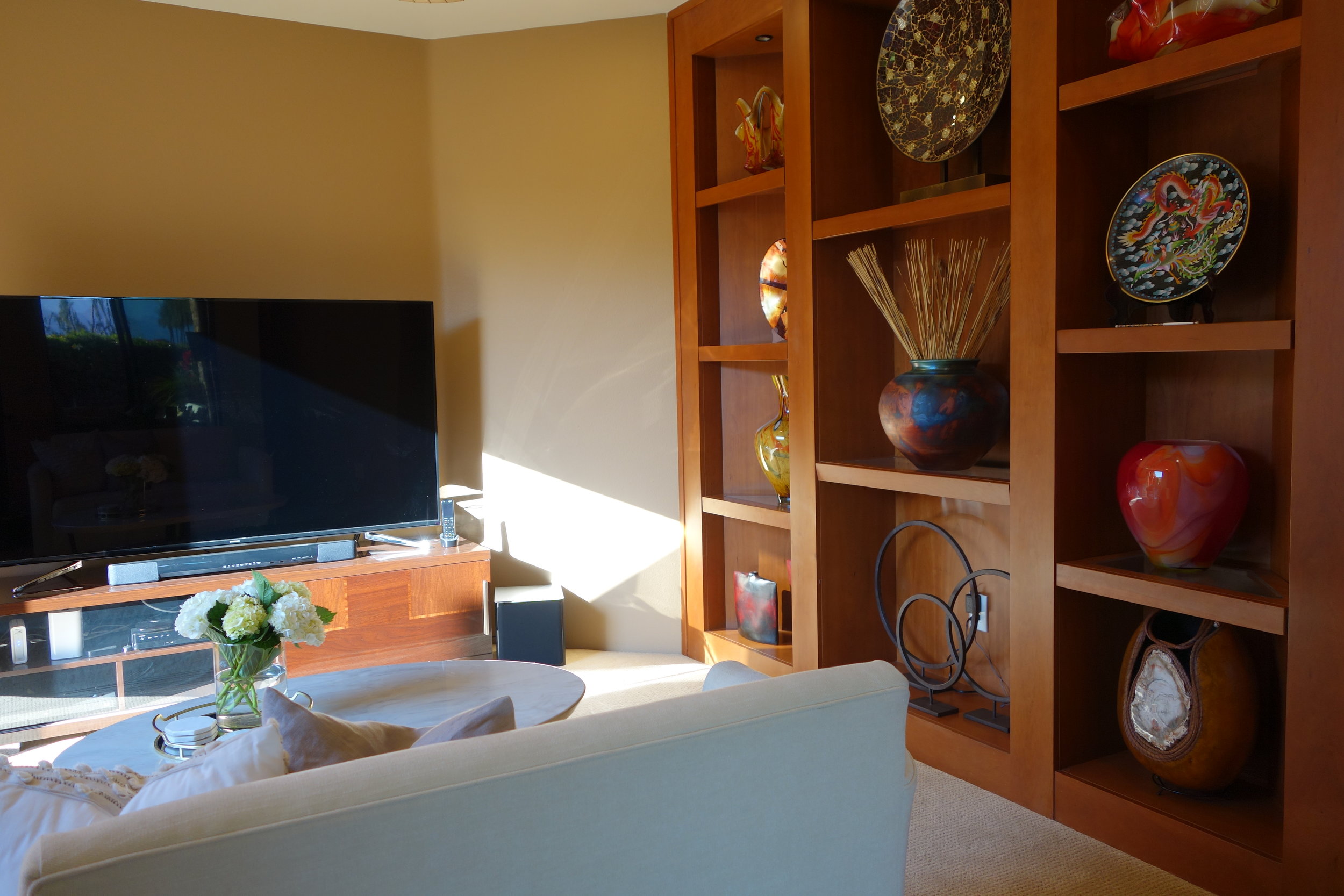
I understand that when watching television, you want the room to be dark like a theater, but the original design of this little media room takes that a little too far I think. This room presented a few design challenges, but Kaleidoscope Design Studio was there to help make the space function while working with those challenges. The first, was that two walls were taken up by sets of double doors, one leading outside into a small courtyard towards the front of the house, and the other leading into the living room and the rest of the home. A large built-in shelving unit completed with glass inserts and lighting, took up another wall. The original design solution to these challenges was to simply ignore them, and hope they go away. The biggest example of this would be the double doors leading out into the courtyard. An oversized loveseat was placed directly in front of this set of doors, and outside there was a very large potted tree placed in front of these doors. Essentially making these doors completely useless.
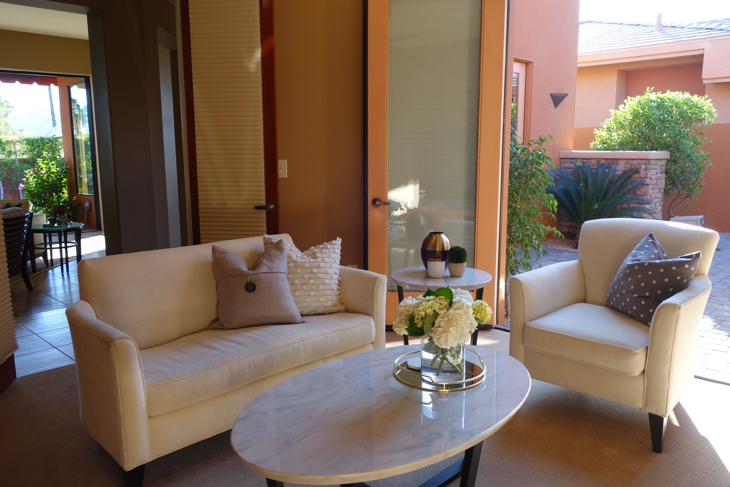
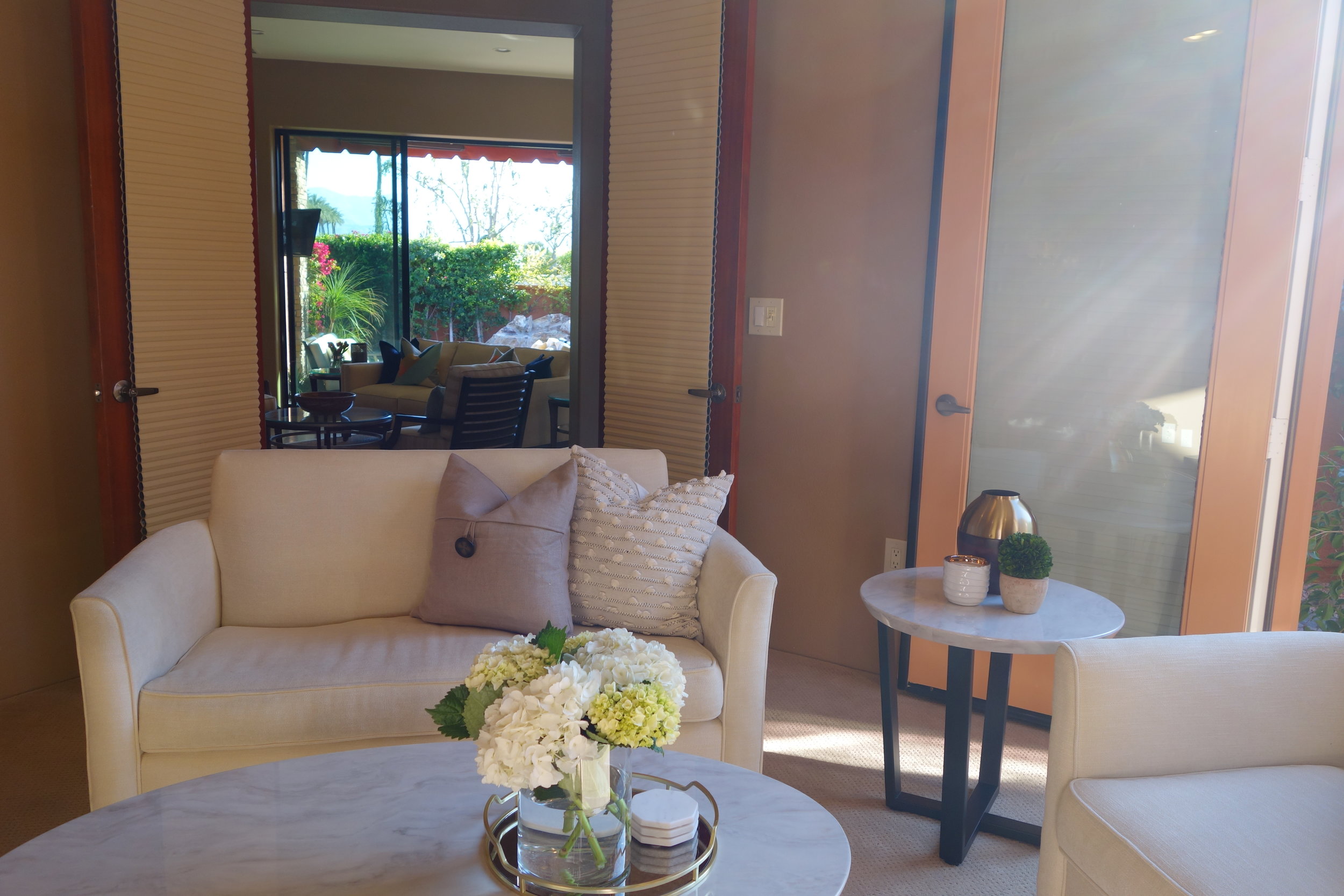
Because the furniture placement was basically predetermined, we had to get a little creative with our furniture solutions. In the end, we were able to provide the same amount of seating in this little media room, without ignoring any of the design challenges. Little spaces like this one with difficult design dilemmas are definitely one of the biggest reasons why homeowners should hire a professional to help them work with these concerns, instead of just ignoring them. The first thing for us to consider when selecting the furniture for this space was scale. It was important to go with something a little on the smaller side, but without having to give anything up when it came to the comfort level. A small loveseat placed in front of the main doors from the living room was the obvious placement, since the media unit had to be placed on the only available wall opposite the entry to the room. Instead of placing another similar piece blocking the doors to the courtyard like the previous homeowners had, we placed a comfy chair in front of it, but not right up against it. This meant that the homeowners would be able to open the doors to the courtyard with ease.
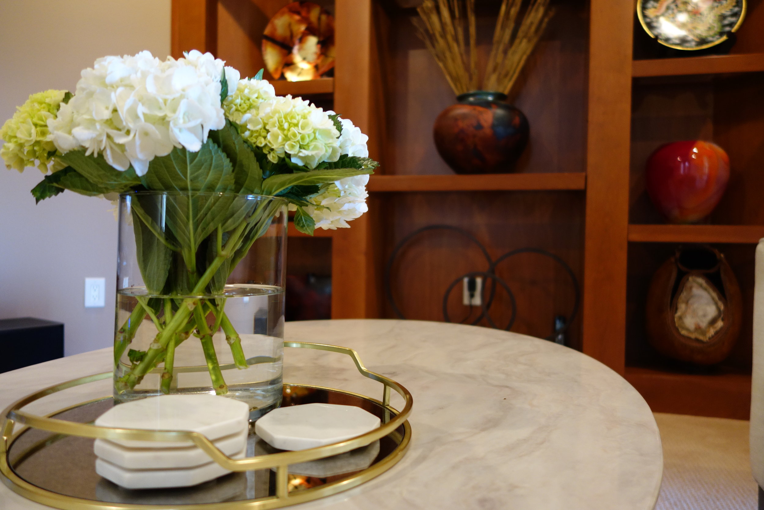
Since the room is a little on the smaller side, we tried to make it feel larger with the finishes we chose. Neutral off-white upholstery, and high-gloss finishes help make the space feel lighter and brighter, which was definitely an improvement. We chose to go with a high-gloss finish on the wood media unit to make it completely different from the existing built-in wood shelves. The high-gloss finish also helps reflect some of the light that was available in the space. We had a similarly glossy finish on the tables, to continue the feeling of a little glam in this otherwise simple space. Opting for an oval coffee table and round side table, allowed for better flow for walking through the little room. Plus an added bonus of the tables being made of resin to only look like marble made the tables more durable, which is crucial for optimum television watching when you kick your feet up. Lastly came the fun part of the design where all the colour got added. We filled the shelves with pieces of art from the homeowners’ travels from around the world and from local art markets. Lots of tonal and textural pillows add even more comfort to the space.


allison has always been in love with interior design. from an early age she has been fascinated with the impact that design has on our everyday living environment, and has the rare ability to walk into a space and visualize it at its full potential. allison believes that interior design is an art form that takes the ordinary to extraordinary, and strives to achieve practical solutions that are both beautiful and elegant.